YOUniversity
Lead Product Designer.Val Mercenaro
Front-end developer.Val Mercenaro
Front-end developer.Richard Dellescas
.Design Challenge
This project was committed to content organisation and mobile responsiveness
We aimed to understanding the true needs of the customer, her clients’ needs and work toward a tidy information structure despite the large amount of content provided by the client
The second challenge was related to the high bounce rate from mobile devices. The ever-growing courses and events were causing a messy bulkiness which was making the accessibility of the content almost inexistent
.Main Deliverables
Tangible outcomes of Sprint
1. Understanding the needs of the client
2. Understanding the needs of the users
3. Defining main outcomes for the project
4. Membership platform funnel
5. Wireframes and mockups of site pages
6. Hi-fidelity prototype of students’ area
Client and users analysis
Finding the common denominator between the client and the users
.Laser focused on client’s perspective
The key to success for this project is listening and understanding the one-of-a-kind perspective of a client like Kerry. Having a clear picture of who She is, who her users are and what are both specific needs will save a lot time when at development stage.
Our design will consist of integrating the client personality, her craft, wisdom, spirituality and business with cutting-edge, advanced design skills and tools, translating it into a compelling and DIFFERENT (but useful) experience.
.My Client Needs
“…to uplift, to inspire, to streamline, to unify, to heal, to empower the client, the community or corporation under our care. No matter what the end goal, we help our clients get there as effectively and joyfully as possible…”
“…delivering cutting edge holistic health technology and mind-body – spirit training…”
An enhanced showcase for the classes, personal training, workshops, retreats, etc.
A strong newsletter opt-in for list building to nurture leads
Features to allow users to quickly and easily find exactly what they are looking for
A sense of movement/flow across the site
Community oriented site – hub for “great teachers from similar schools of thought”
A membership area to stream monthly webinars/seminars (with guest speakers)
Highly effective lead generation system/marketing funnels throughout the site
.Target Users True Needs
They need to rest assured that other people had outstanding results
Prospects need to find what they are looking for quickly
They need the ability to share their experiences with people that have similar lifestyle/issues/concerns/results
They want an excellent user experience not to get frustrated
They need to understand much better what they’re actually buying and clear rates
HMW
They need a spiritual guide to learn, be inspired and be nurtured from, a fine, luxury shelter
for the mind & body
They need to feel a sense of belonging
They have a sense that becoming a member of the community will significantly improve their life
.Aligning clients’ needs with those of the users
Home page as services' display
Attention to key features
– develop a homepage with bold, clean designs to draw immediate attention to key features
– make browsing easy for users
– clean, user experience-centric design to make a statement and to help the right elements stand out
– minimise distractions
Intro to classes
– make each section of the homepage as an intro with CTA to classes, workshops, etc.
Mission statement
– clear and simple 70/80 characters long headline together with an intro video on top header
Customer experience optimisation
Top strategic priority
Efficient, accurate, self-evident features
Mobile responsiveness
– consider this as the most crucial aspect of the redesign
Community oriented features
Custom user profile
– build a network within the very platform
Fast login system
– take away the hassle of re-entering contact details
– collect data and build a database of highly targeted prospects
Install Qualaroo insights
– collect feedback to continuously improve service
List building and lead generation
Lead magnet
– create the strategy for the other important issues/needs of the audience and make it accessible for members only
Convert visitors into leads
– clear and sexy value proposition
– non invasive but strategically positions email optins
– captivating emails follow up
– flawless page flow
Members only content area
Personalized experience
– create brand affinity and customer retention by giving people the possibility of becoming members of the tribe
– create the possibility to for members to interact with one another
– use behavioural data for newest services/product ideas
Monthly webinars and events
– monthly Q&A calls
– recorded webinars
Main courses' content strategy
– 1 Q&A per month
– 1 course of video lessons every 3 months
.Membership sales funnel experience
For this project I have used a flowchart (built with Sketch) to draw the experience of lead towards the purchase
1. Leads enter the funnel via a FB ad or a Lead Magnet (blog with CTA, etc)
2. Receives various emails with discounts and incentives to be part of the membership website
3. Gets to become a member or retargeted and nurtured for future products built around the user feedback
.Keeping all organized with our favorite PMS
I use ton of applications and softwrae but nothing has never really substituted Trello for project management system, and clients love it for its short learning curvve and intuitivity


Desktop site design
Getting the idea juice flowing…
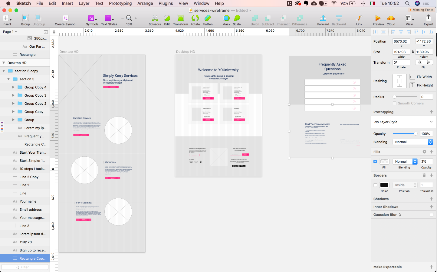
.Wireframing
I designed the project wireframes to communicate the project ideas focusing on the architecture rather than design and to represent the base for the prototype to be developed.
.Mockups
I designed the project wireframes to communicate the project ideas focusing on the architecture rather than design and to represent the base for the prototype to be developed.


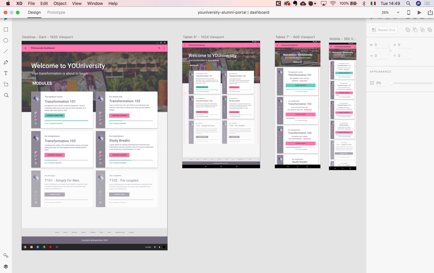
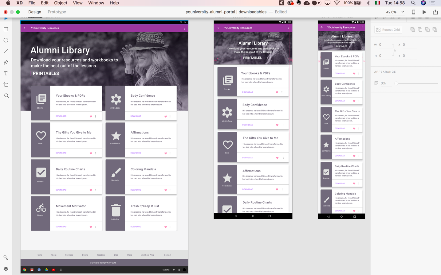
Students dashboard prototype
Researched and defined the devices used by the students and built the mobile version of the e-learning platform
Summing it up
UI Consistency
Created consistency for the user by devising repeatable elements
Information Architecture
Fixed the poor information architecture of the previous platform design
Mobile Accessibility
Built a mobile user’s friendly version of the platform to contrast the high bounce rate